

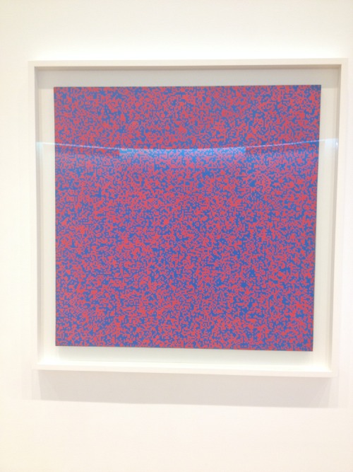
Close up of Random Distribution of 40,000 Squares using the Odd and Even Numbers of a Telephone Directory (1960) – Francois Morellet [MOMA New York]
A not very good picture of Random Distribution of 40,000 Squares using the Odd and Even Numbers of a Telephone Directory (1960) – Francois Morellet [MOMA New York]
Data visualisation should be disciplined and beautiful – a lesson from 1960s minimalism
I stumbled across this piece by Francois Morellet in the MOMA New York – Random Distribution of 40,000 Squares using the Odd and Even Numbers of a Telephone Directory (1960).
Morellet created this piece by imposing upon himself a strict system that provided a framework for him to work within. It’s a technique still used today by artists who choose to use numerical data sets formatted according to similar rigid structures. Some use their own personal data captured using wireless-enabled wearable activity trackers as a starting point for their creativity.
Although this painting doesn’t help the viewer achieve a greater understanding of the data set from which it was created, it is data visualisation in the truest sense – a visually appealing and yet disciplined representation of data.
With the current enthusiasm for cheaply put together infograhics by brands who just want to be part of the trend, I’d rather look at Morellet’s work any day.